Wednesday, August 8, 2012
Blog Revision
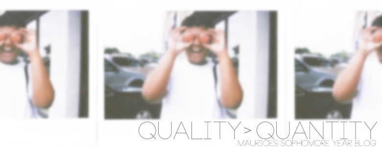
For this coming school year, I wanted my blog to look simple. I designed my banner including a picture of myself, but added a blur effect so the picture isn't overpowering the title. To make navigating through my old posts easier, I decided to label and sort each blog post based on what project it was for. My background and header was changed and I also changed the title of my blog from "Writing Off Into Space" to "Quality > Quantity".
Subscribe to:
Post Comments (Atom)
This comment has been removed by the author.
ReplyDeleteHey Mauricee! I like the theme white theme you have going on here. Plain, simple, and it's nice to the eyes. It's easy to navigate around and it shows maturity and creativity.
ReplyDeleteGood job!
Hey maurice, nice blog. I like the simplicity of it. I also like how you organized all your blog post on the assignments.
ReplyDelete